05. Counting Missing Data
Counting Missing Data
If you have a large dataframe, and it contains a few missing values (None or a numpy.NaN), then you can find the count of such missing value across the given label.
For this purpose, you can use either of the following two analogous functions :
The functions above are alias of each other and detect missing values by returning the same sized object as that of the calling dataframe, made up of boolean True/False.
Step 1. Load the dataset
import numpy as np
import pandas as pd
import matplotlib.pyplot as plt
import seaborn as sb
%matplotlib inline

# Read the data from a CSV file
# Original source of data: https://www.kaggle.com/manjeetsingh/retaildataset available under C0 1.0 Universal (CC0 1.0) Public Domain Dedication License
sales_data = pd.read_csv('sales_data.csv')
sales_data.head(10)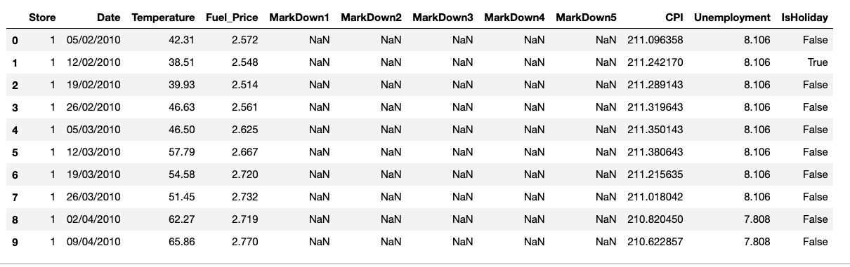
sales_data.shape(8190, 12)
# Use either of the functions below
# sales_data.isna()
sales_data.isnull()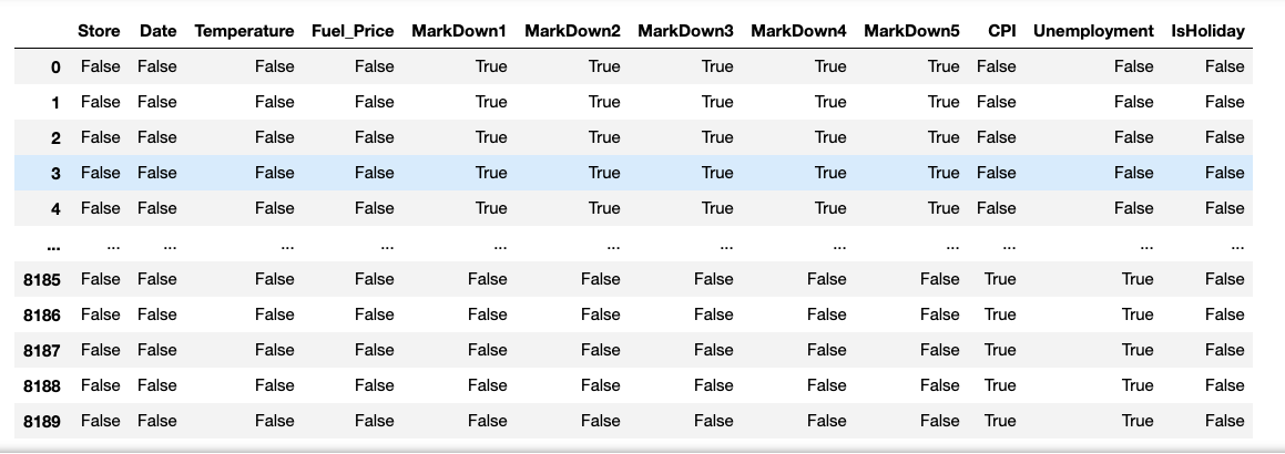
We can use pandas functions to create a table with the number of missing values in each column. Once, you have the label-wise count of missing values, you try plotting the tabular data in the form of a bar chart.
sales_data.isna().sum()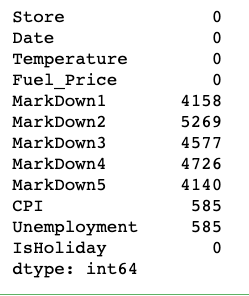
What if we want to visualize these missing value counts?
One interesting way we can apply bar charts is through the visualization of missing data. We could treat the variable names as levels of a categorical variable, and create a resulting bar plot. However, since the data is not in its tidy, unsummarized form, we need to make use of a different plotting function. Seaborn's barplot function is built to depict a summary of one quantitative variable against levels of a second, qualitative variable, but can be used here.
Step 2 - Prepare a NaN tabular data
# Let's drop the column that do not have any NaN/None values
na_counts = sales_data.drop(['Date', 'Temperature', 'Fuel_Price'], axis=1).isna().sum()
print(na_counts)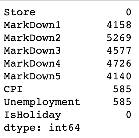
Use seaborn.barplot()
Step 3 - Plot the bar chart from the NaN tabular data, and also print values on each bar
# The first argument to the function below contains the x-values (column names), the second argument the y-values (our counts).
# Refer to the syntax and more example here - https://seaborn.pydata.org/generated/seaborn.barplot.html
sb.barplot(na_counts.index.values, na_counts)

# get the current tick locations and labels
plt.xticks(rotation=90)

# Logic to print value on each bar
for i in range (na_counts.shape[0]):
    count = na_counts[i]

    # Refer here for details of the text() - https://matplotlib.org/3.1.1/api/_as_gen/matplotlib.pyplot.text.html
    plt.text(i, count+300, count, ha = 'center', va='top')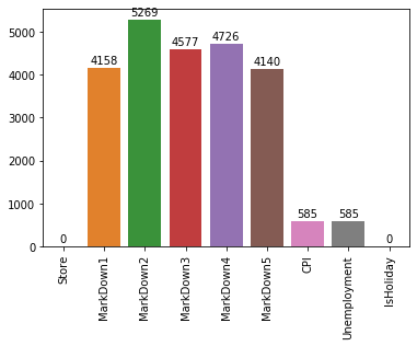
Note - The seaborn.barplot() is a useful function to keep in mind if your data is summarized and you still want to build a bar chart. If your data is not yet summarized, however, just use the countplot function so that you don't need to do extra summarization work. In addition, you'll see what barplot's main purpose is in the next lesson when we discuss adaptations of univariate plots for plotting bivariate data.